Place examined. Krakow
Branding Identity, Typography, Layout Design
Baltimore MD, 2026
Typography class, MICA
About
Kraków is the second biggest city in the south of Poland. This city is special to me because this is where all key events happened that made my current studying in the U.S. possible. Everything from English proficiency tests to VISA interviews. I depart and leave from here when I’m flying to visit home.
It is also a hometown to my lifelong friend, Margo. This project is dedicated to Kraków. It holds a special place in my heart because of the experiences I had here.
The task
In this project the idea was to consider how we experience an environment and how this can be captured and expressed through typography. How to capture the essence of a place with both content and expression. How to translate the idea of a place and transform space for a variety of different formats, proportions and media.
The challenge
The overwhelming feeling is intentional. I challenged myself to create a maximalist design. I wanted to experiment with how far I could push the design to be trashy and noisy while still keeping its hierarchy and legibility.
Stylistic & color choices
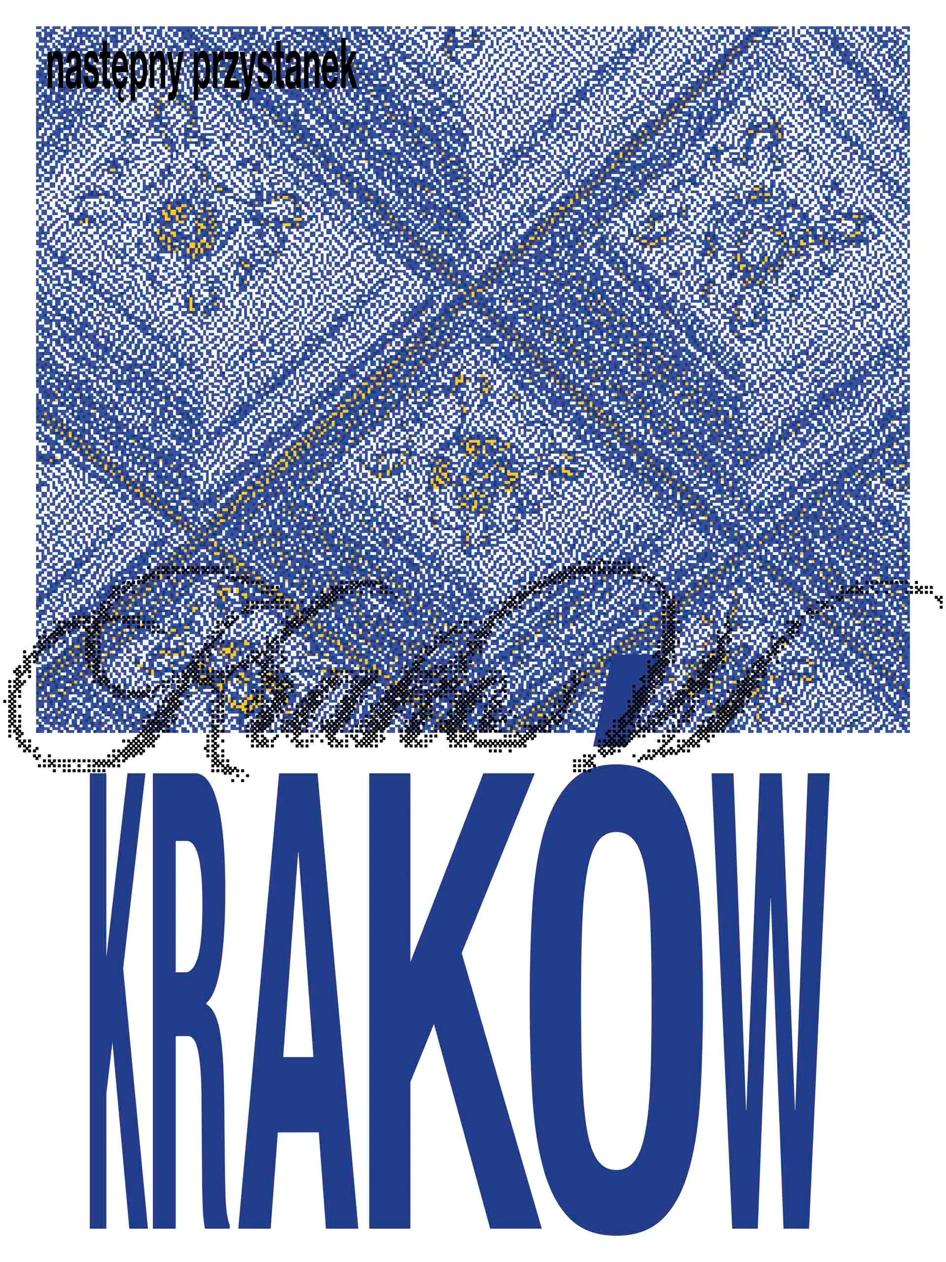
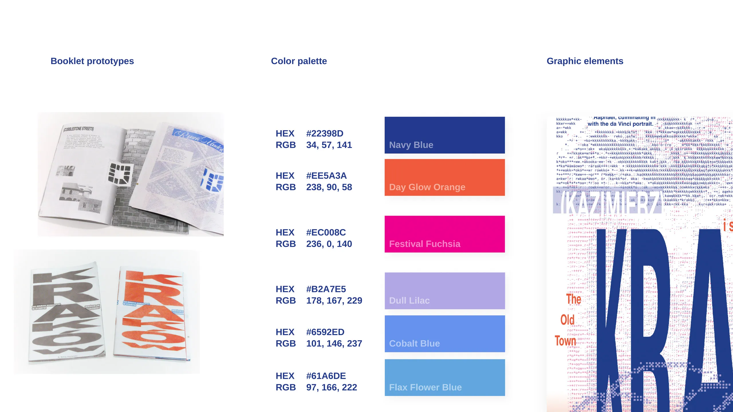
Much of the visual style is inspired by Polish rave culture and its graphics.
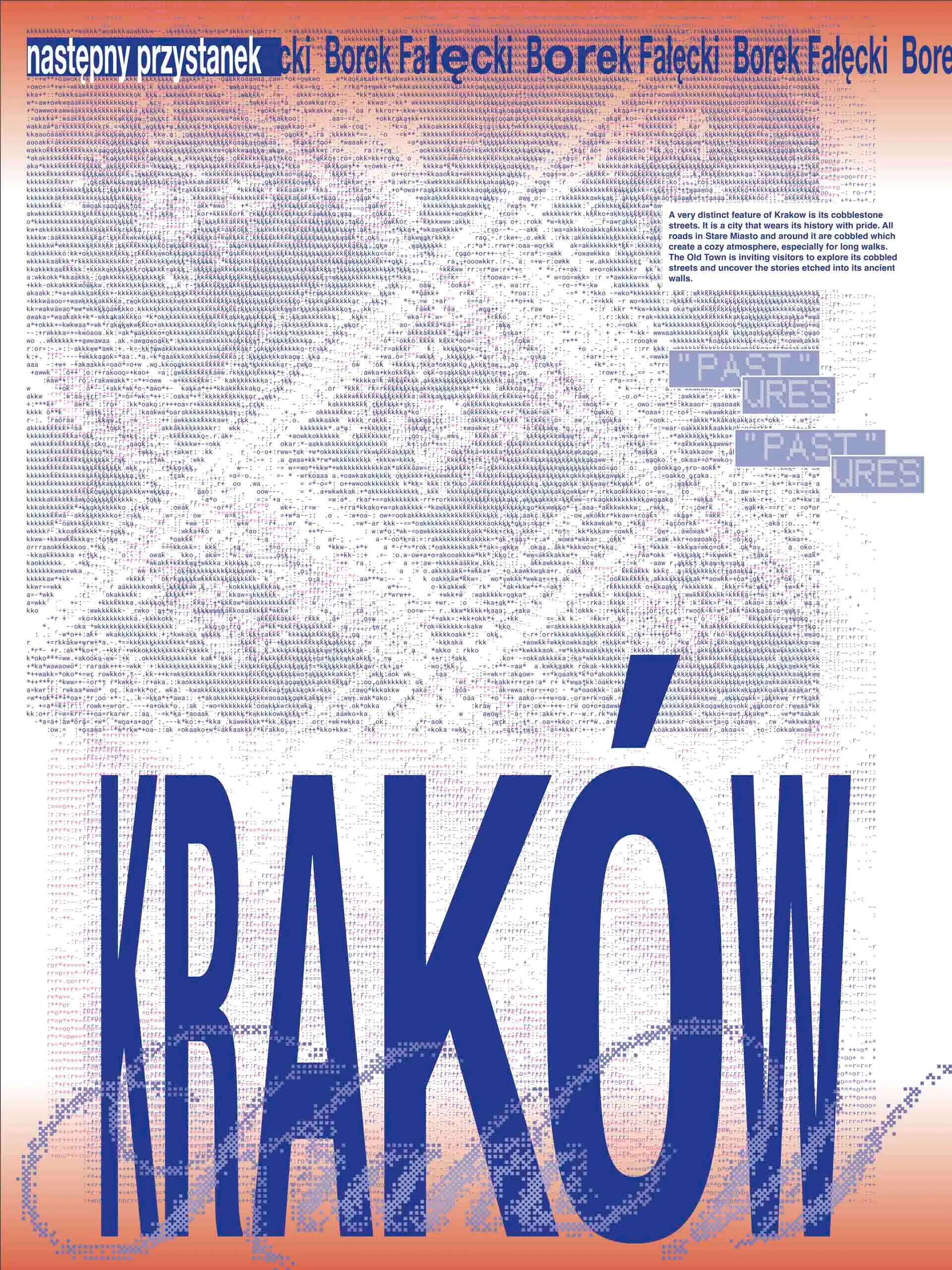
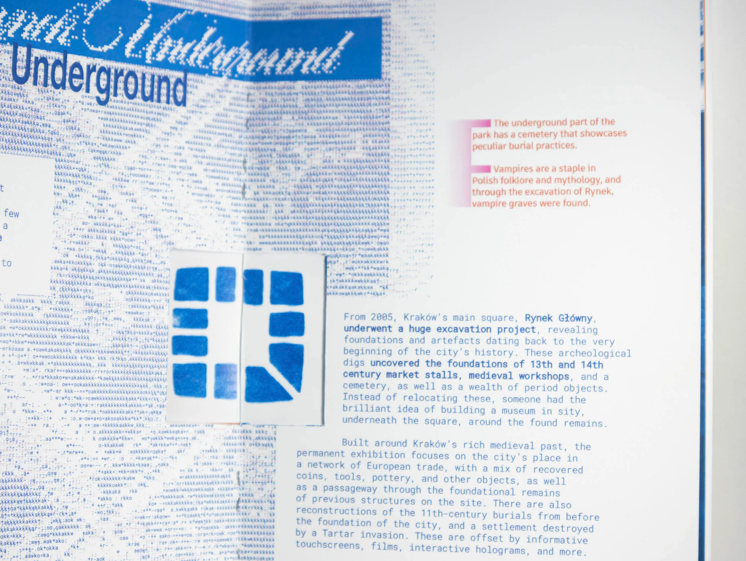
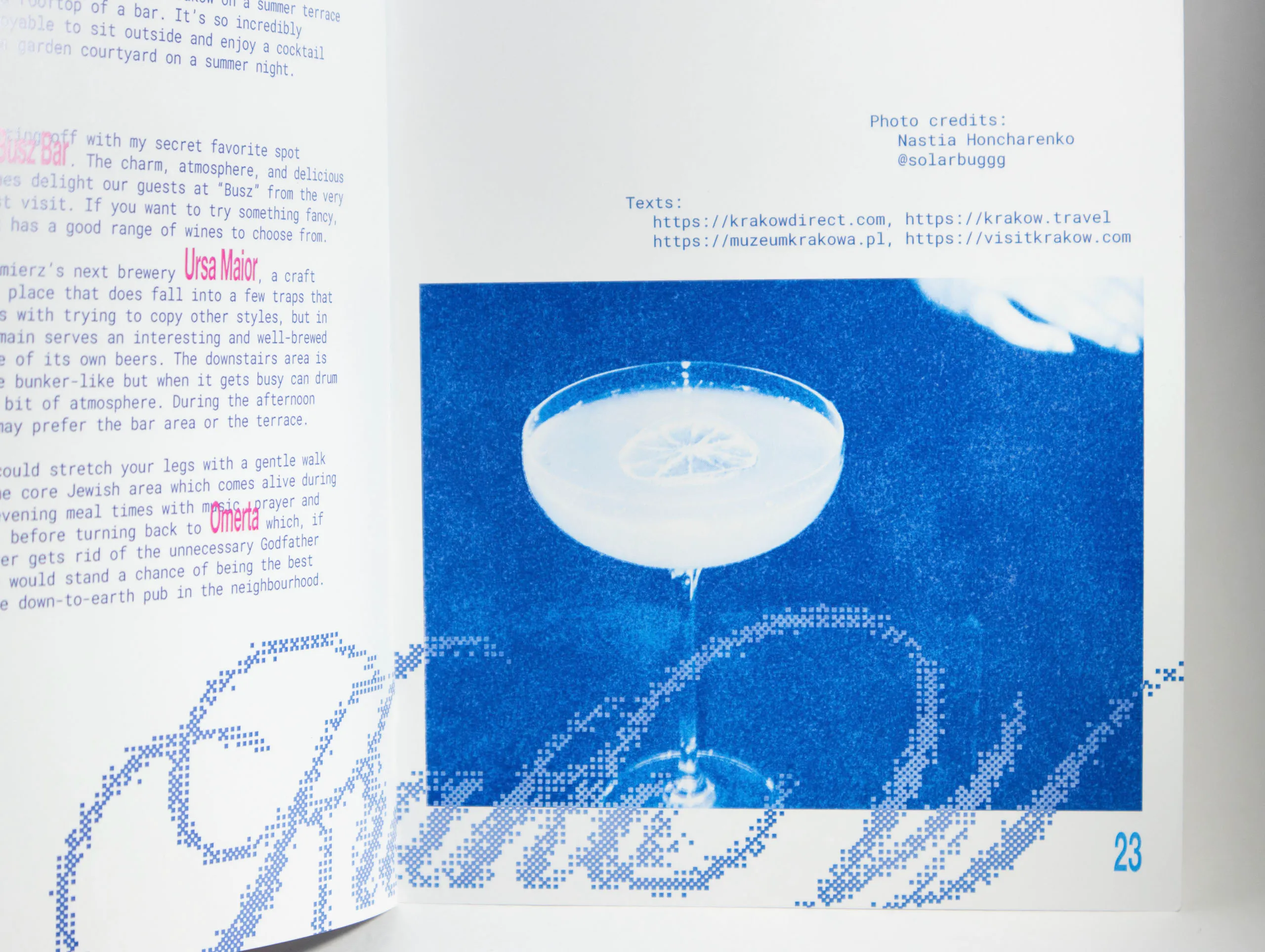
This chaotic anti-design is meant to represent energetic and dynamic genre of jumpstyle. Stretched text, ascii (text art) and pixelated elements brings a good deal of the visual noise.
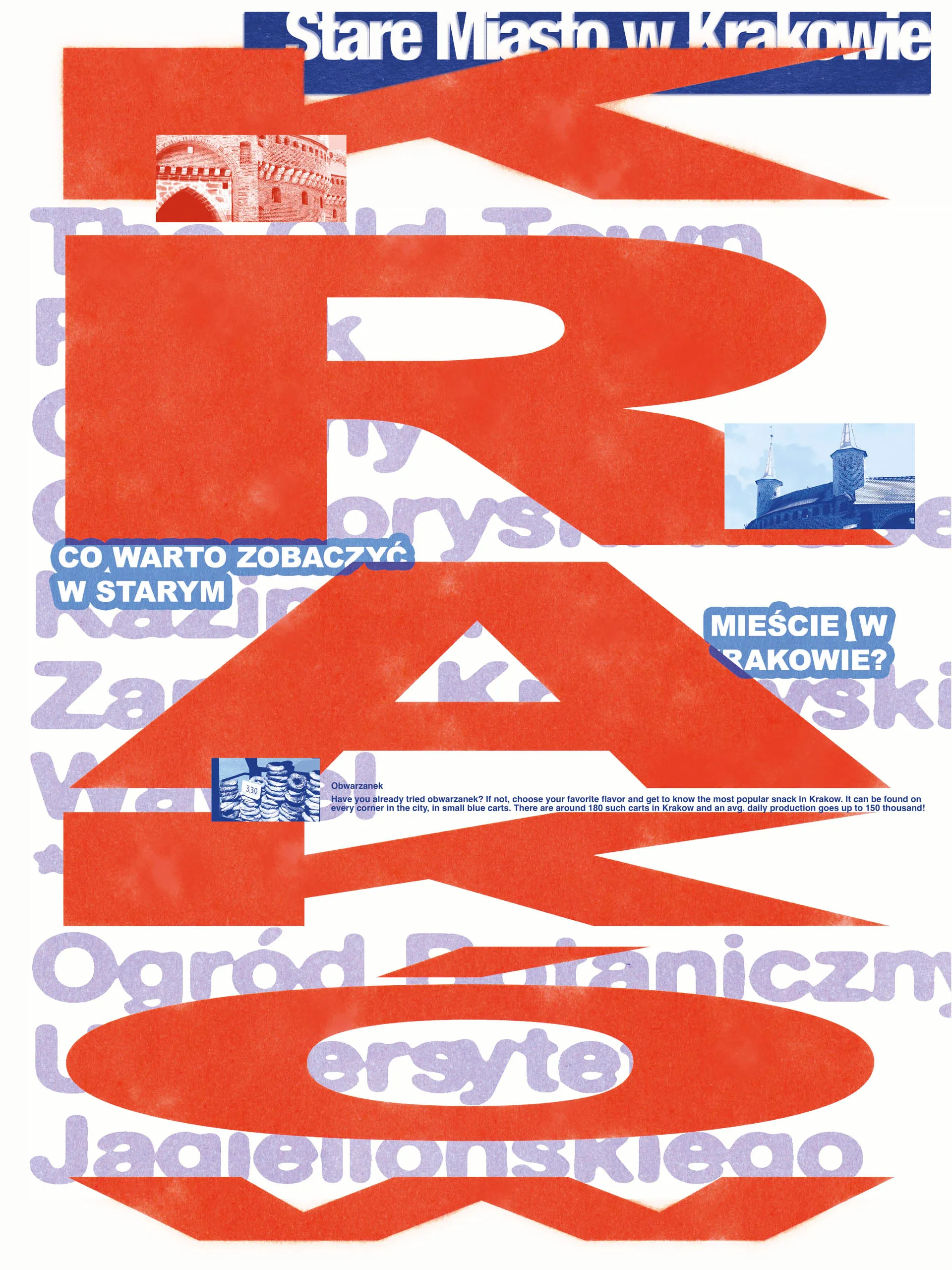
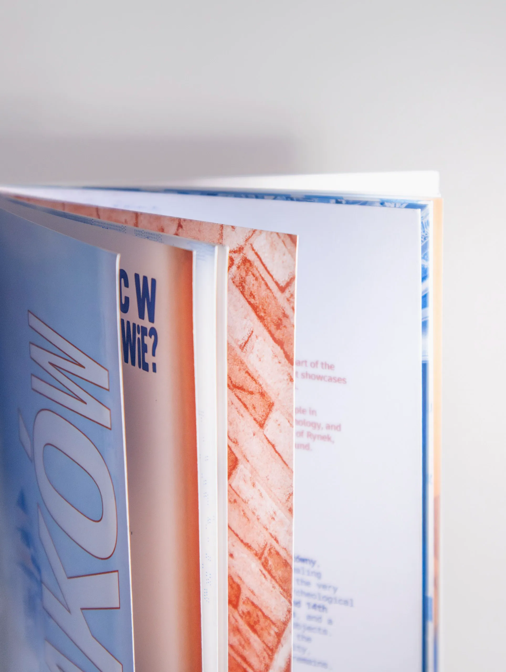
Blue is the main color of Kraków city branding identity and red symbolizes its red brick buildings that prevail in the Old Town.
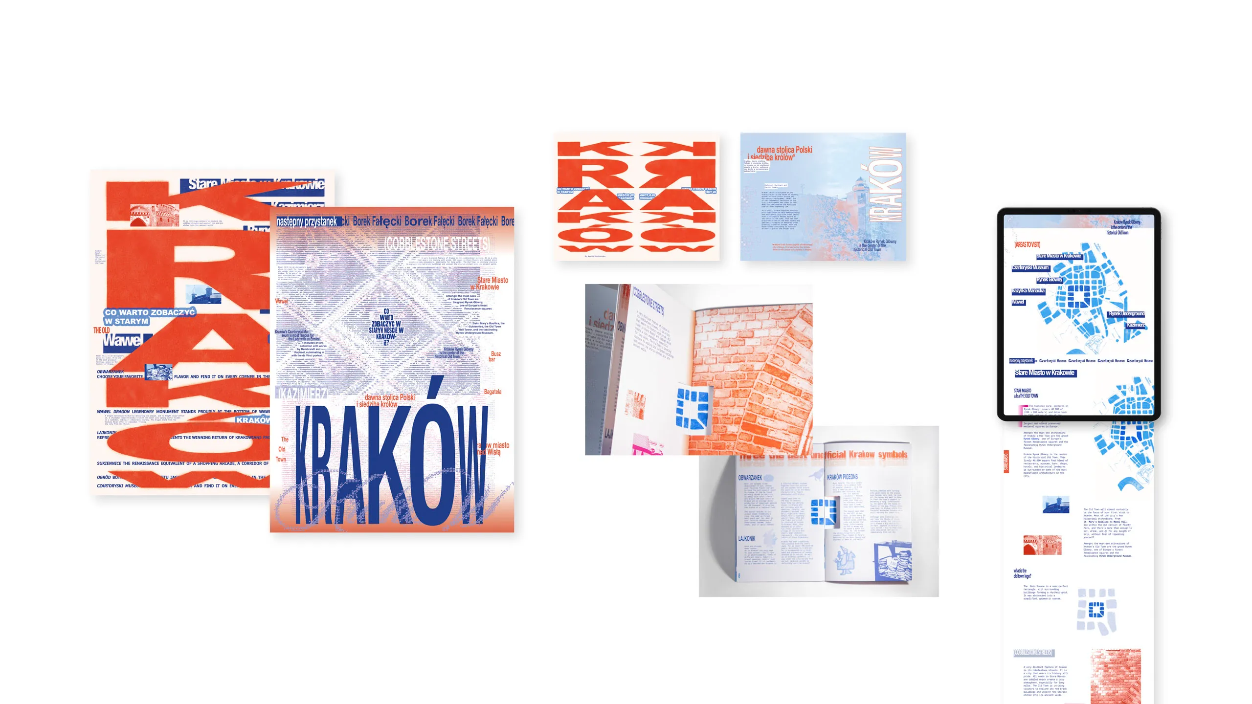
Posters: vertical and horizonal stretch
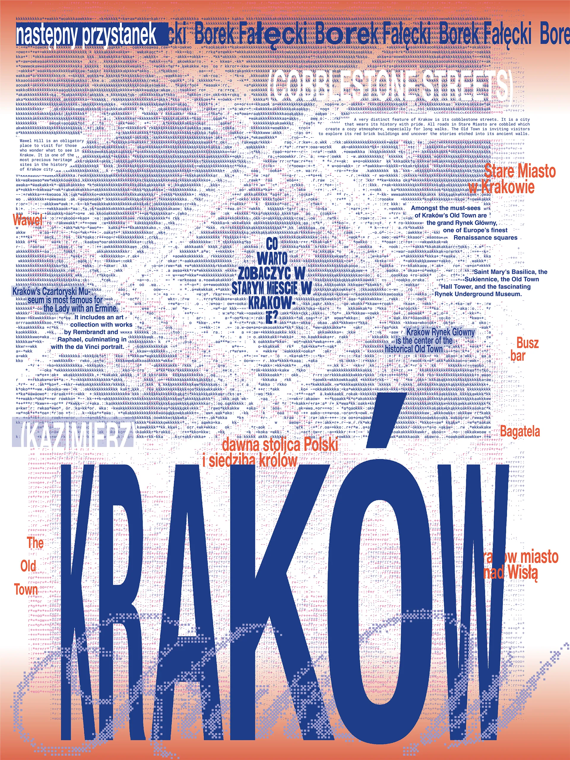
Vertical - literal. It functions as a chaotic tour guide. The top part lists main areas. The bottom part has a listing of city’s unofficial symbols.
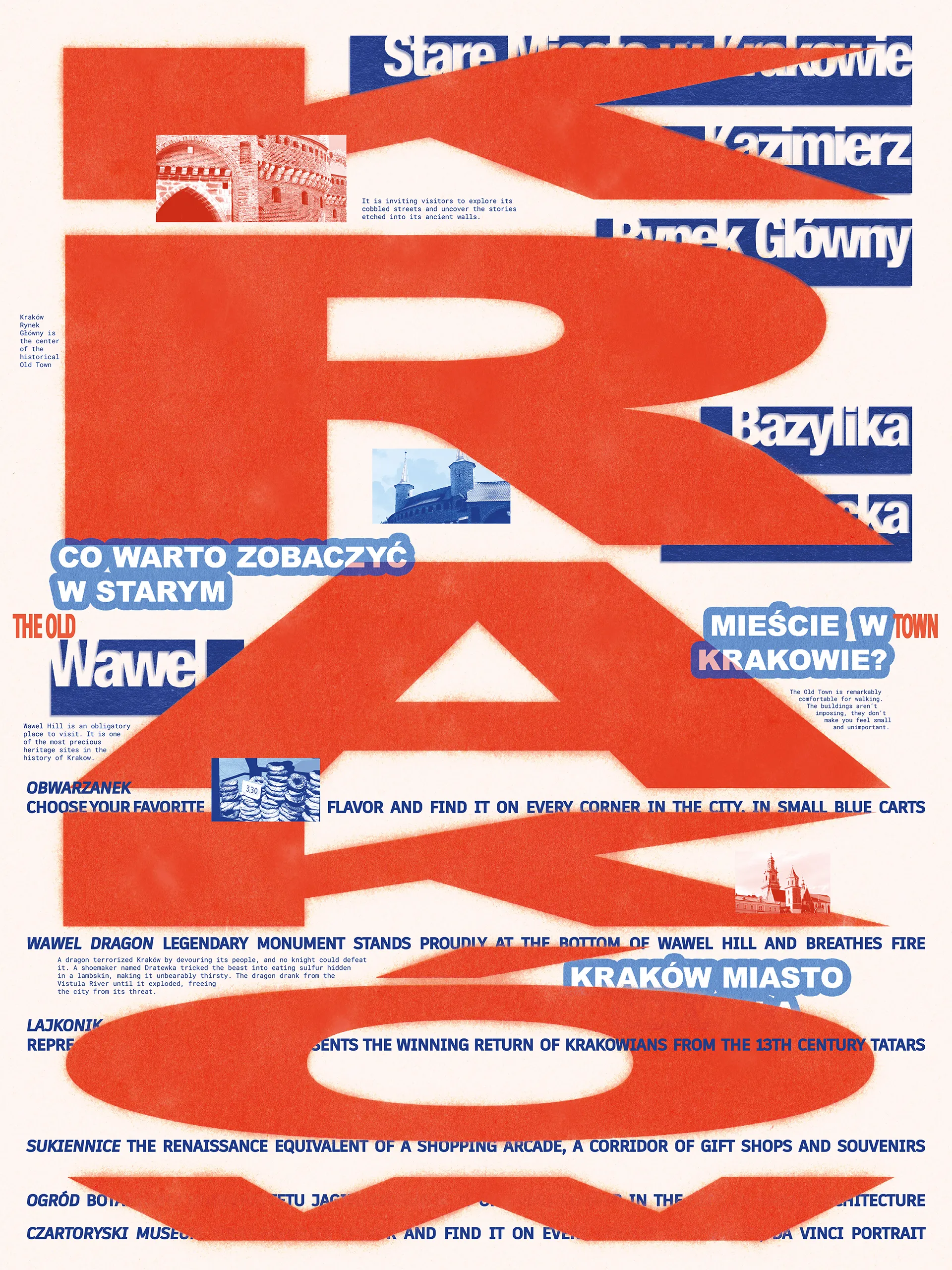
Horizontal - expressive. The pattern is a processed photo is Wawel castle interior. The text is less cohesive and informative.
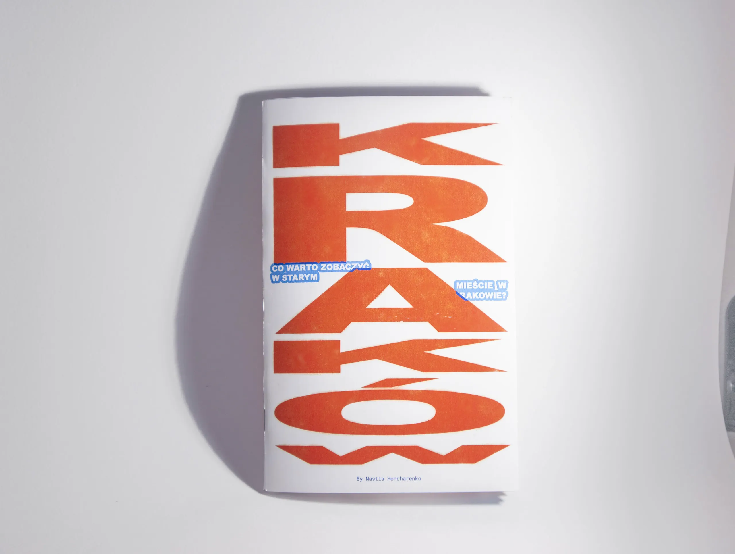
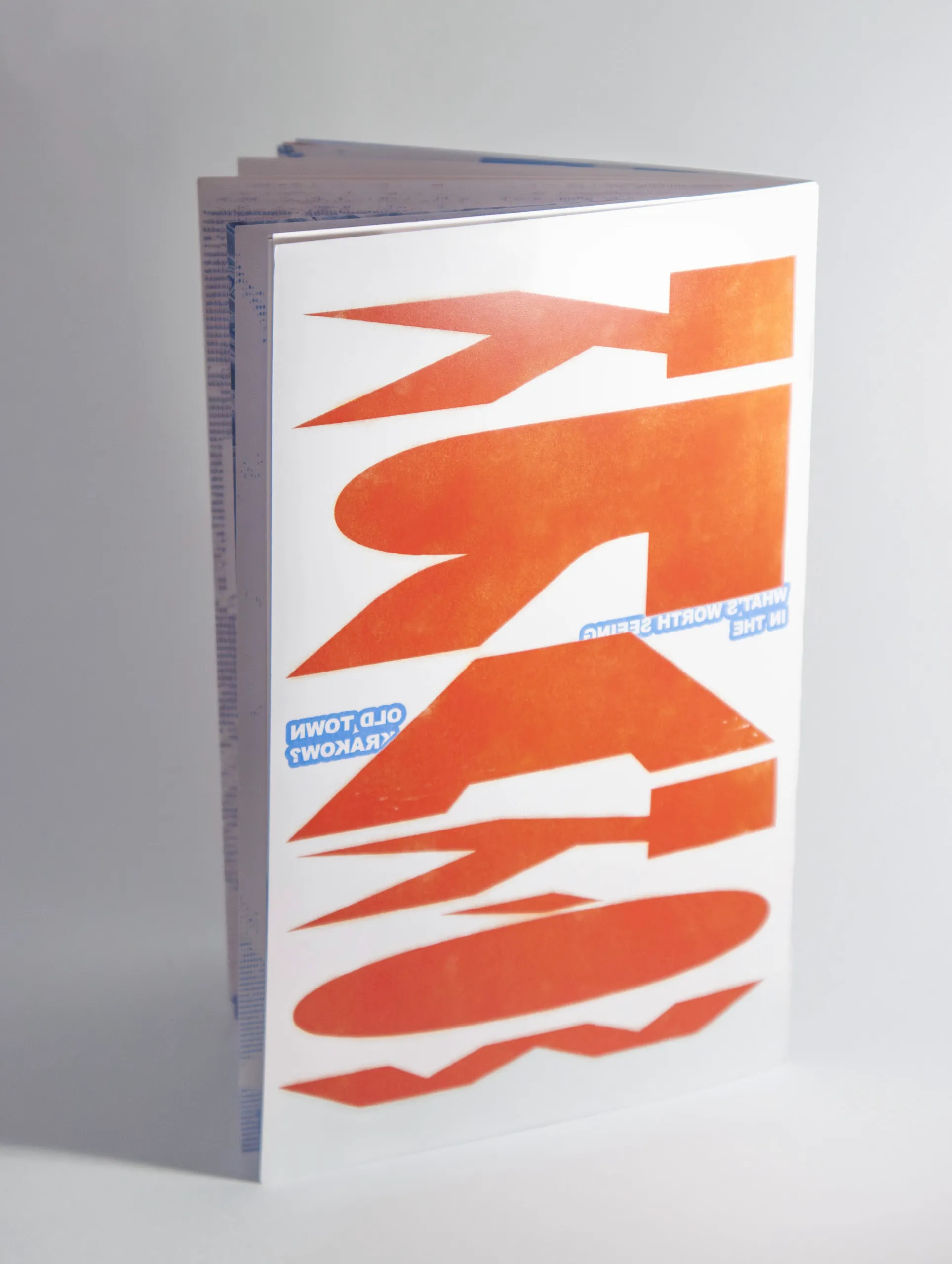
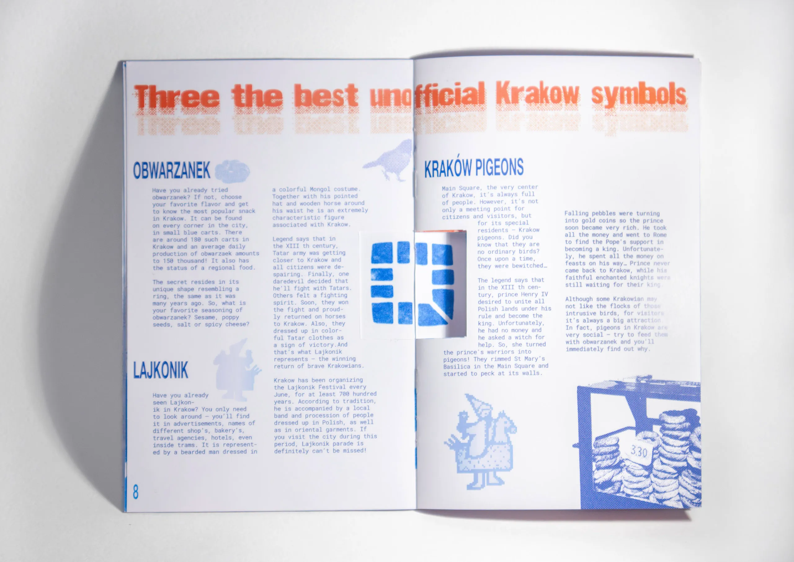
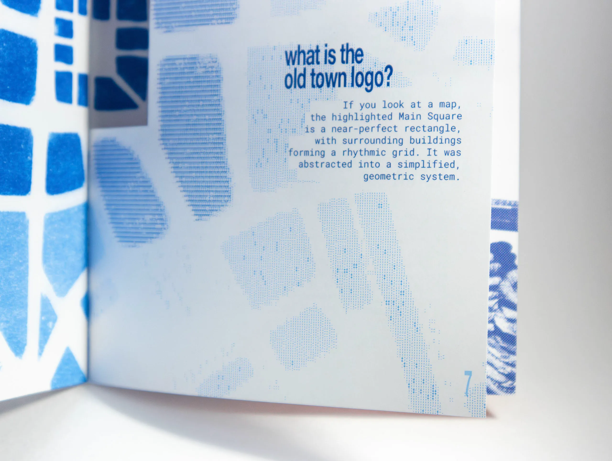
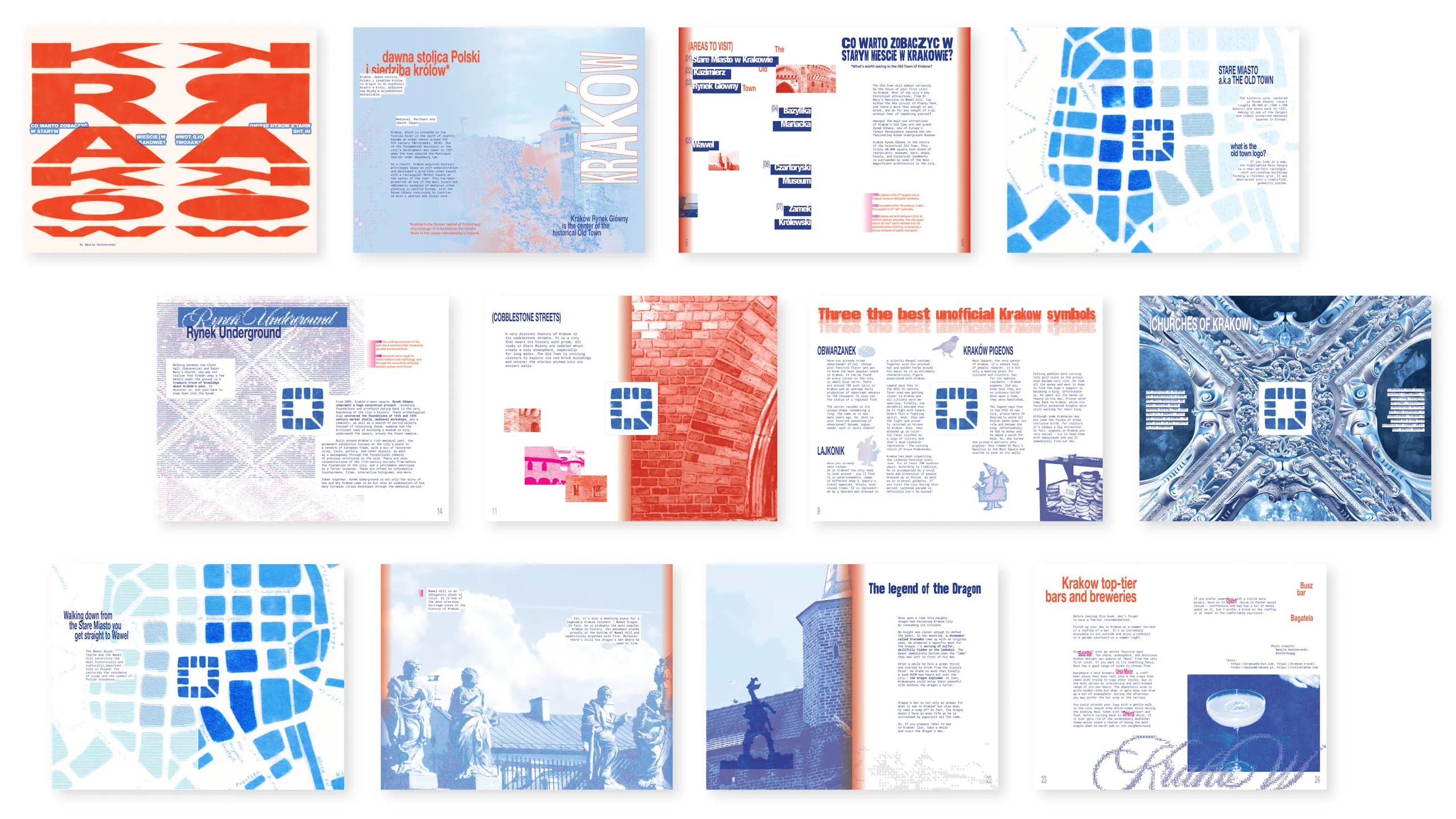
Die cut booklet
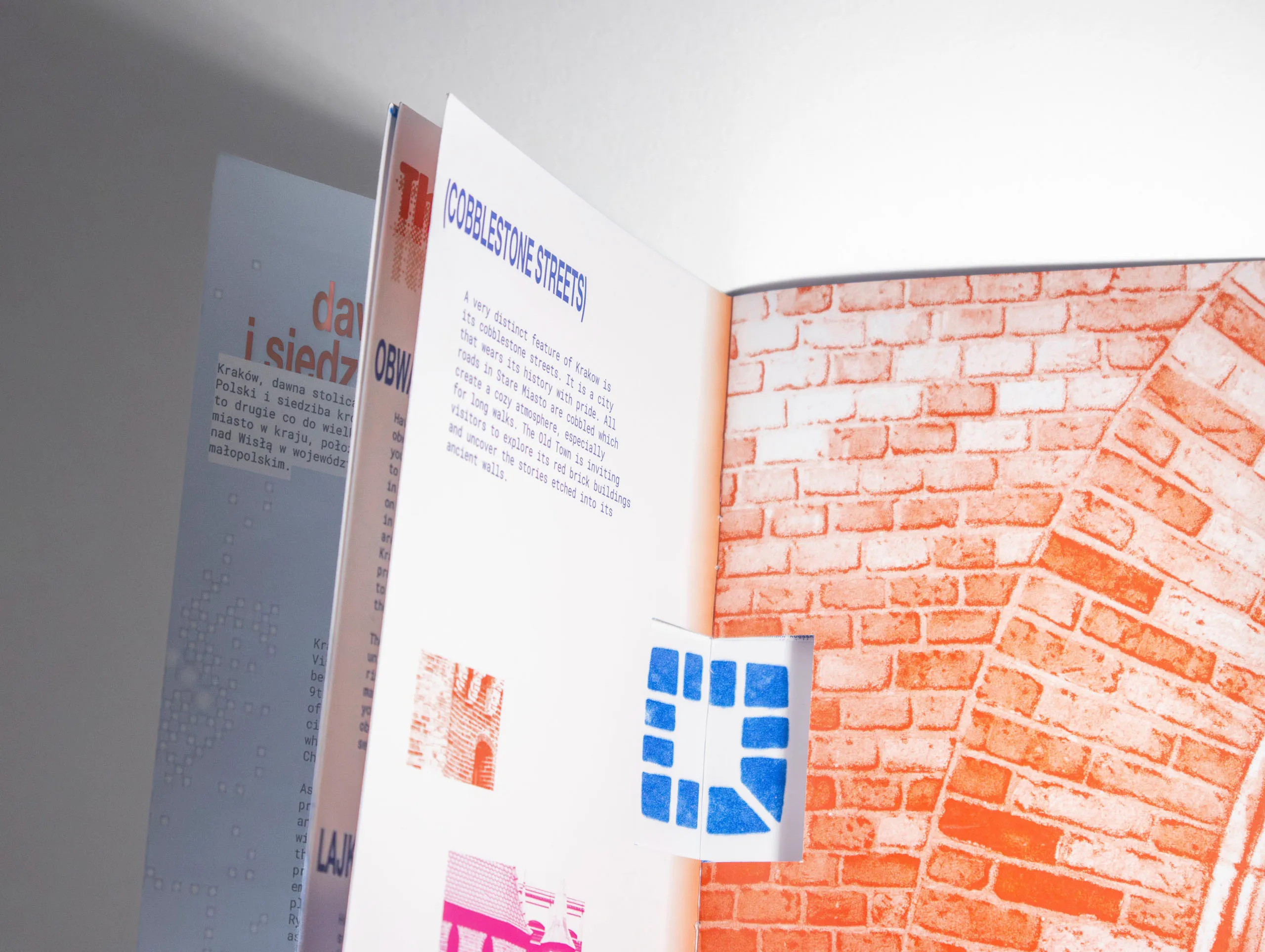
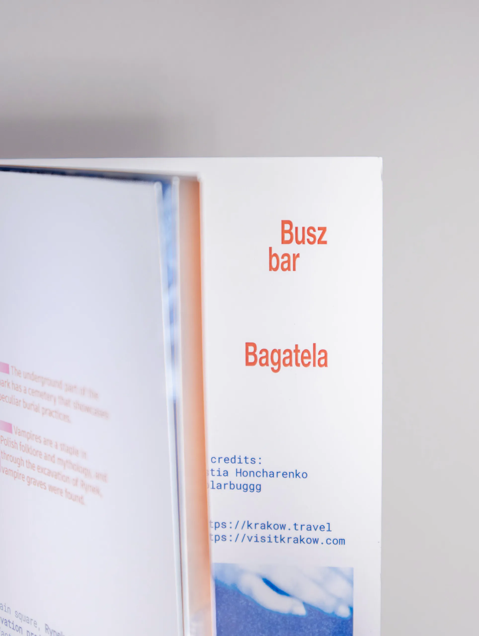
This is a 24-page booklet with extended texts based on the info introduced in the posters.
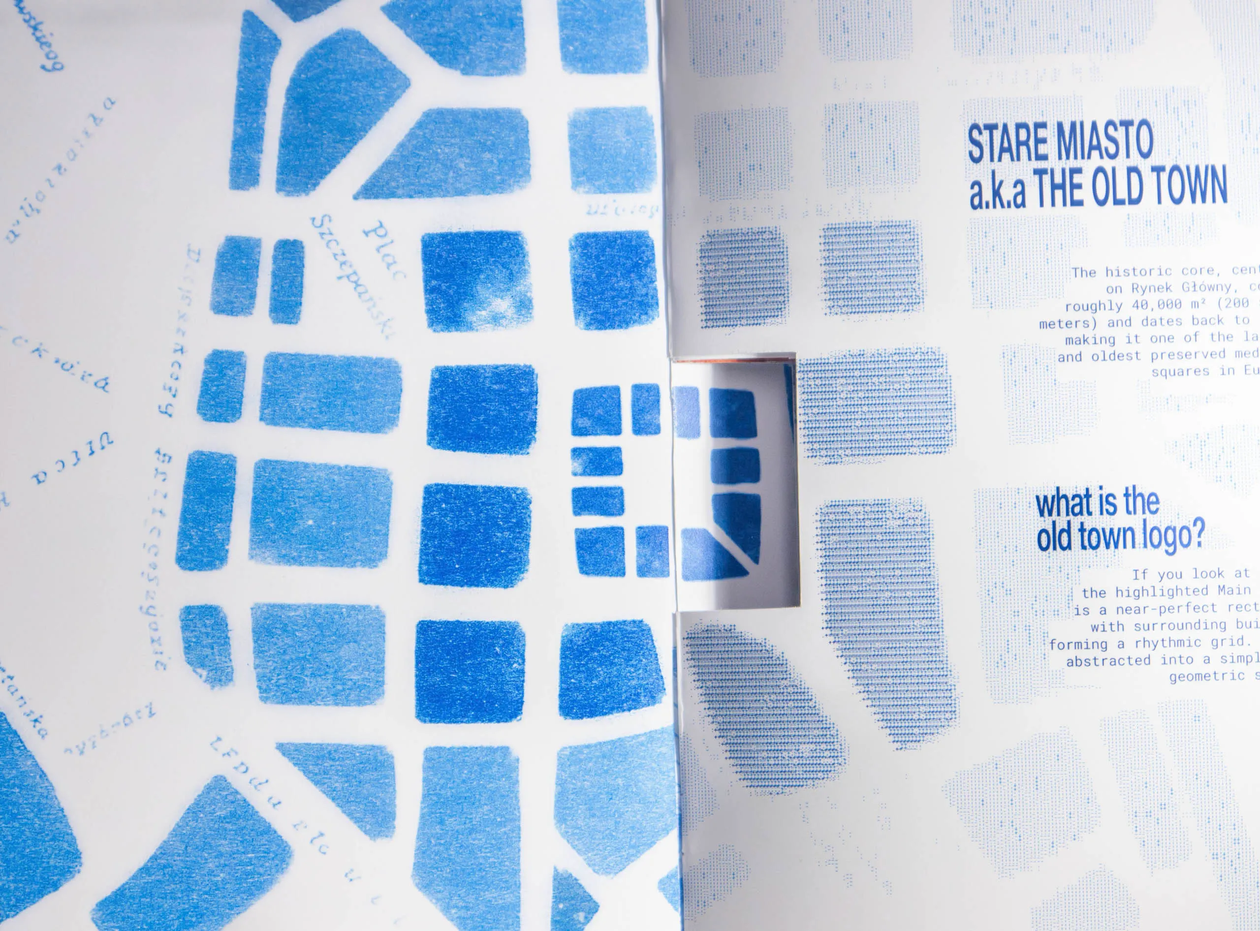
The element of interest
Rynek Główny is the heart of Stare Miasto aka. Kraków Old Town. It is an almost perfect square which prompted me to make it the center of the booklet.
All spreads
Single-page screen
The elements of interest here are animated map on the second screen and running titles imitating public transport screens at the top.
The phrase następny przystanek that you will see quite often. It means ‘next stop’. In each of three parts I included around 7 ‘stops’ with a big focus on Stare Miasto.
Poster drafts